Famously, an image produced by an artificial intelligence (AI) has recently won the Colorado State Fair’s fine art competition, suggesting AI can be creative. But can it be used to create technical imagery, such as graphical abstracts, posters, and infographics for academics and students in electronics and programming, asks Fabricio Pamplona, Co-Founder of Mind the Graph, the free online infographic maker for scientists?
If you don’t already know about the Colorado State Fair, it’s a big deal. It’s been running every year for the last 150, give or take the odd exception during COVID and wartime, and attracted 461,104 visitors in 2022. This year it featured performances from Stone Temple Pilots, Foreigner and Grammy winners, The Band Perry. Alongside these luminaries of the music world, the event also showcased its prestigious fine art competition, which is where things got complicated.
The image that won took the artist in question, Jason Allen, 80 hours to create, and bagged him a $300 dollar prize. The problem arose later, on social media, when Allen revealed that those 80 hours had been spent fine-tuning a description of the image, which he entered into Midjourney, a narrow AI app that can turn text into images.
Allen’s work, which is, frankly, stunning, raised interesting questions in the art world, but for me it posed another kind of quandary entirely. Could it be used to create scientific illustrations, such as graphical abstracts, posters, and infographics?
In the spirit of experimentation, I thought I would test the thesis and see how well the available AI tools stack up against the work we can deliver as plain old human beings.
DreamStudio.ai
Unlike Allen, I began with DreamStudio.ai, a free tool, which describes itself as, “an easy-to-use interface for creating images using the recently released Stable Diffusion image generation model. Stable Diffusion is a fast, efficient model for creating images from text which understands the relationship between words and images”.
I decided to see if DreamStudio could create something to match up to the Periodic Table, which I think of as the best scientific infographic of all time. In fact, it predates the very word infographic by at least 100 years.
I entered the following text, “All the elements and their atomic numbers and chemical symbols expressed in an understandable way,” and the image that resulted is labelled Fig. 1. The key problem is that the image doesn’t mention any elements, their atomic numbers, or their chemical symbols.
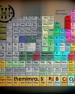
But perhaps the brief isn’t sufficient? After all, Allen spent 80 hours fine tuning the description for his award-winning artwork. To test this idea, I then entered the entire text of the Wikipedia page that describes the periodic table. That must be sufficiently comprehensive?
The results were interesting to look at and certainly work as a piece of art, but not as a scientific infographic or abstract. I think that the problem is that, while the AI is very good at understanding and interpreting text, it isn’t yet strong at reproducing words as part of an image.
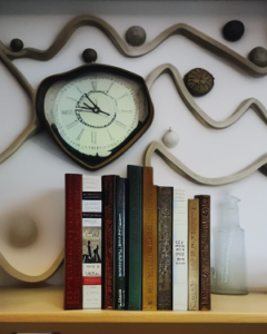
To prove this, I tried typing in the names of several of my favourite books and authors along with the description ‘on a bookshelf’. Fig 2 illustrates the results this trial produces when the text used reads, “Paul Scherz’s Practical Electronics for Inventors on a bookshelf”. As you can see, it’s an interesting image, with more than a hint of Salvador Dali, but very little evidence of the hobbyist inventor and author in question.
Midjourney
Next, I took to Midjourney, which requires the user to sign up to a Discord server and, as a result, socialises the process, allowing you to see the images other people are creating. Again, there is some excellent work on there which, while not necessarily to everybody’s taste, can be impressive.
I typed in the slash command /Imagine and the following description, “An anatomically and scientifically accurate picture of the human hand, on a plain background, in high resolution, ideally 4K”. The results are shown in Fig. 3.
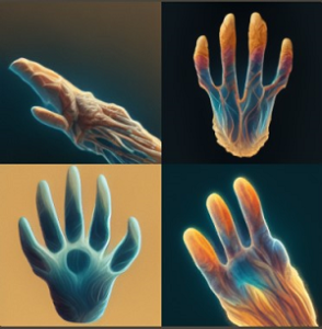
As you can see, they are both terrifying and not entirely anatomically accurate. This demonstrates well one of the other drawbacks of AI led image generation, its inability to handle accurate physiology – something which is clearly a disadvantage if your task is to create a graphical abstract to submit to a publisher.
Results
It’s clear that AI isn’t yet a great way to produce scientific images, posters, graphical abstracts or infographics, something which represents a key part of the electronics and software academic publishing process, as you can see here in a submission guide from the Journal of Computational Electronics.
However, the limit is really the ability of the user to first train the AI and then describe the desired outcome. I wonder what results I would have received if I had been able to train DreamStudio.ai with the actual periodic table and all the alternative versions of it that have been produced over the years? What if I had also been able to enter some ‘bad models’ using tables that show inaccurate or unreadable data and teach the AI what to avoid?
The outcome could have been very different. With some progress in training methods perhaps AI could be helping humans win scholarships and achieve tenure in the future, as well as win art prizes and achieve notoriety as Allen did in Colorado?
Fabricio Pamplona is the Co-Founder of Mind the Graph, the free online infographic, graphical abstract, poster, and slide maker designed for scientists and technicians by scientists and technicians. The tool is used by 250,000 academics and researchers around the world, including at Harvard University, Stanford, and UCLA as well as Pearson, McGill and Abbott. You can create a free account here: https://www.mindthegraph.com/.