
Data Visualisation is an important tool in identifying qualitative insights in the field of data science. Data Science is the science of analysing raw data using statistical and machine learning methods.
Written by Yasir Alvi.
In this article, we are going to understand what data visualisation is and the role it plays in the world of data science.
What is data visualisation?
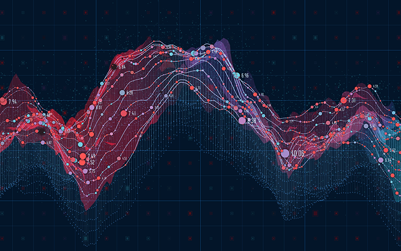
Data visualisation is the graphical representation of data that captures the viewer’s attention and helps to reveal the smallest details present in the data. Data Visualisation helps to prevent the loss of raw data when using other data analysis tools. Graphs, tables, maps, and chart are ways in which visualization of data are achieved.
Data visualization provides an accessible way to visualise and understand patterns in data, trends, and outliers. It is essential to analyse the large dataset and make data-driven decisions. In our contemporary world, data visualization is much more than a word. It’s a whole process that provides solutions to a lot of problems, be it big data that we need to analyse or a presentation we need to make for a multinational company, or a startup firm.
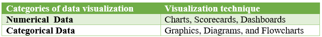
Categories of data visualisation
Data visualisation is categorised into two types. These categories portray the nature of the data or the type of dataset to be analysed.
Numerical data
Numerical data is also referred to as quantitative data. It is a form of data that is measurable or represents an amount such as the weight, age, height of a person, IQ level, and blood pressure. Etc. Numerical data visualisation is the simplest way to reveal large data sets and raw numbers for easier interpretation. Numerical data are grouped into two types;
- Continuous data
- Discrete data
Categorical data
Categorical data is referred to as qualitative data. Categorical data represent characterized or classified such as gender, race, age group and employees’ biodata. This type of data visualization is all about establishing connections. Categorical data are grouped into three types;
- Binary data
- Nominal data
- Ordinal data
Let’s take look at the visualisation technique employed in the two categories discussed so far.
Significance of data visualisation in data science
In this section of the article, we’ll look at how data visualisation has contributed to making data scientist jobs easier.
Machine learning models
Machine learning models are amongst the most important skills a data scientist must possess. All models require lots of analysis performed on a given dataset. Hence, good knowledge about a given dataset is pertinent for a profound analysis of its feature and the possible development of a model with great accuracy.
Developing a model for a given problem requires clear visualisation of the path to take. Data visualisation is a tool that has proven over time to provide this path through exploratory data analysis. Regardless of how complex the dataset may be, visual techniques make it easier to analyse and extract relevant information.
Summarising results or presentation
Data visualization plays a vital role in presenting information derived from a data scientist’s analysis to a company’s stakeholders. it prevents any form of redundancy in information transmission to clients that do not know data interpretation.
More so, visuals are great because they don’t only help in presenting all details obtained through data analysis of an organisation, but it makes it very simple for a non-data analyst with little or no knowledge to understand.
Top 5 data visualisation tools
- Tableau
- Looker
- Zoho analytics
- Sisense
- IBM cognos analytics
In summary, data visualisation plays a critical role in identifying new patterns and trends in our everyday life and business. In this regard, businesses are focused on hiring data analysts skilled in visualizations to help them make business decisions.